Today, the Guardian newspaper launched its new format and layout. In the coming days I hope to provide a full opinion on the new design.
So far, I like its continental feel and new typeface cut.
Tuesday, September 13, 2005
Monday, September 05, 2005
Cooper Black Continued
A quick look through the Yellow Pages (and a day in the life of me) reveals...
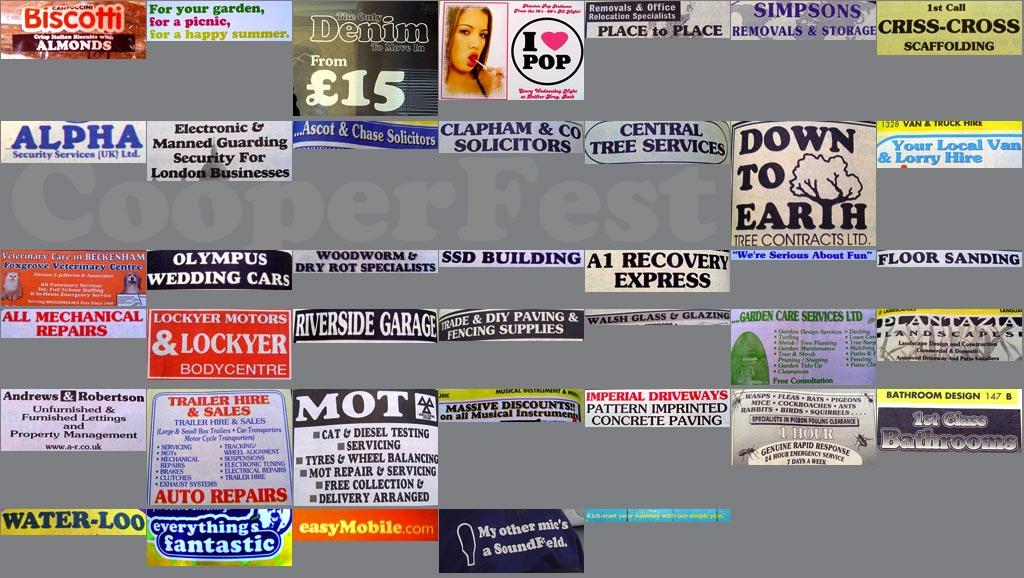 It's everywhere!
See previous entries for further explanation.
STOP PRESS: Not all examples are the typeface Cooper Black, however they have many similarities to Cooper Black that may lead the untrained eye to believe they are the same typeface.
Friday, September 02, 2005
Toppling type - Iceland

I was recently talking to Erna Hreinsdóttir, an Icelandic designer-type friend of mine, about something when she mentioned how absurd some signposts look in Iceland.
Over there, place names are not seperated into seperate words, and given the complexity (or perhaps absolute clarity) of the language (look at this supermarket website as an example: 10-11 - the chaps seen on the website are the Icelandic Trinny & Susannah, by the way. It's worth a look just for them), you end up with very long place names.
So imagine the pictured standard signpost pointing you in the direction of Kirkjubæjarklaustur, Hafnarfjarðarvegur or Hallormsstaðaskógur. The sign itself is getting close to the length of the post to which it is fastened. Pure genius.
Finally, here's a snippet from my current online chat window with Erna:
Erna says:
this is actually a word:
Erna says:
vaðlaheiðarvegavinnuverkfærageymsluskúraútidyralyakippuhringur
Erna says:
but it is not used very often
Spencer E Holtaway says:
that's insane
More later.
Subscribe to:
Posts (Atom)

