!------ANALYTICS CODE HERE---------------

Tuesday, November 22, 2005

AT&T


AT&T unveiled their new logotype this week, following SBC Communication's successful purchase of the telecoms giant. Which was nice.

Modernisation of the former logo graphic, plus a change of typography has led to a fresher look for the communications company, without losing its brand recognition.

The globe is 2d-3d. What you see here is the 2d (print) version. However, elsewhere on the web and on other interactive services, the globe is said to rotate. I've not seen this yet.

Good job InterBrand chaps.

Thursday, October 06, 2005

About Mister Chappy-Chap


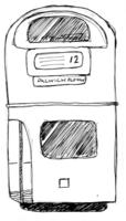
Mister Chappy-Chap is a character from a short animation I created in response to the Routemaster Bus in London. The following paragraphs are excerpts from the explanation I included with my animation, a foreward if you will.

The character of Mister Chappy-Chap comes from the idea that the Routemaster bus is a quintessentially British vehicle, much like the Black Cab or Concorde for example. For the past few years, I have been fascinated with Martin Parr's photography as he captures 'very British scenes' that seem absurd even to the most British viewer. Since moving to London I have seen more of Britain's unique eccentricities than I ever saw in Bath. This may be because I am more used to the West Country way of life, but before moving to Dulwich, I had never seen a public house with two entirely different sides.

The Crystal Palace Tavern, like many other Victorian public houses has a central bar, with a 'lounge side' and 'bar side'. The Crystal Palace Tavern, however, has maintained the lounge side to Victorian standards: the round gas lamps, etchings on the wall, large mirrors and iron-footed tables, while the bar side has been 'upgraded' to suit modern needs: two projected televisions, wood flooring and very 'Ikea' furniture. Stella Artois is only available on the modern bar side.

Liam, a friend of my brother, is now finishing his MA in English at Oxford University. During his interview, he was asked where he lived. When he replied 'Dulwich', the interviewer perked up and informed Liam that he too once lived in Dulwich:

'Where do you drink?' the interviewer then asked, and Liam replied 'the Crystal Palace Tavern'.
'Ah ha, or the 'CPT' as they seem to be calling it these days'.
According to Liam, the next question was the decider in his success on enrolling to the course: 'do tell me... which side do you drink on? The right side or the left side?' Luckily for Liam, he drank on the right side, the Victorian side.

I imagine Mister Chappy-Chap would get along with - if not be slightly frightened by – due to his kind and unassuming nature – the Oxford 'Don' that interviewed Liam, and that he too would drink on the right, as he is stuck somewhat in the past, enjoying the family roast every Sunday, smoking his pipe, 'thinking of England' and chasing that Routemaster bus he so adores. I have it in my mind that Mister Chappy-Chap does not however live in close proximity to the Crystal Palace Tavern. Mister Chappy-Chap is a Dulwich Villager. The Village is a posh enclave at the top of Lordship Lane, housing the Dulwich Picture Gallery and Dulwich College – one of the finest private schools in the country. Maggie Thatcher used to live in Dulwich Village.

Dulwich Village does not feel like London, unlike East Dulwich, which holds some resemblance to surrounding areas such as Brixton, Camberwell and Peckham (the Rye is, after all, just down Barry Road from Dulwich Library).

Mister Chappy-Chap works in a bank in Bank, much like Mr Banks in Mary Poppins. Although he is surrounded by computers at his job, he is only competent in doing with them what he needs to, and prefers doing sums in his WH Smith grid-lined notebook with his Parker fountain pen (one of the more expensive ones, of course). He carries a handkerchief, and one spare – in case a lady needs one – and washes them both by hand every night whether they have been used or not. Mister Chappy-Chap gets his hair cut at Keith's Barbers on Northcross road. Keith, to me, is an amazing piece of Martin Parr's Britain. In a world of Toni & Guy, Aveda and Garnier, Keith does what he's always done and what he knows how to do: a short-back-and-sides. Keith appears to be around sixty years old, but I expect he may be much older. His back is naturally arched from leaning over the head of each and every customer he has had for goodness knows how many decades, but he does an incredible job. I went to Keith's once. For £7 and quarter of an hour of my time, he trimmed my hair with incredible precision and skill – a steady hand like his, at his age, is to be desired. Keith does not require bookings, so pop in if you’re in the area.

I can imagine Mister Chappy-Chap visiting Keith on a weekly basis and he would, of course, get a proper shave on that occasion. Mister Chappy-Chap likes to be tidy and lives by the rule 'only the best men shave twice a day'. He enjoys the sting of after-shave.

While I have described Mister Chappy-Chap as rather posh and a likely hard right-winger, I feel I must make it clear that he is much more soft and innocent a character than that. He appears as he does through sheer naivety – as though he has had is eyes shut for fifty years, perhaps opening them once a fortnight to realize that shillings have disappeared along with outhouses. After all, he is a comedic character in the animation, susceptible to slap-stick mishaps much like the classic early film comedian Charlie Chaplin, born on East Street in Walworth, not far from where I picture Mister Chappy-Chap to reside.

Mister Chappy-Chap is, also, a small part of me – as an American with a British (private school) upbringing and family heritage (my grandfather was from Liverpool), I think I feel ‘Britain’ on a day-to-day basis perhaps more than someone born here. While I take it for granted, having lived here for almost seventeen years, there are still little bits and pieces that surprise me, that remind me I’m in Britain and that this is not my home country.

To conclude, the mixture of my early years in the United States and the upbringing I had in the UK culminates in my interest in what I could call the truly British Britain – the places, people and things you couldn’t find anywhere else in the world – one of which being the Routemaster bus.

Tuesday, September 13, 2005

New Guardian

Today, the Guardian newspaper launched its new format and layout. In the coming days I hope to provide a full opinion on the new design.

So far, I like its continental feel and new typeface cut.

Monday, September 05, 2005

Cooper Black Continued

A quick look through the Yellow Pages (and a day in the life of me) reveals...
It's everywhere!
See previous entries for further explanation.
STOP PRESS: Not all examples are the typeface Cooper Black, however they have many similarities to Cooper Black that may lead the untrained eye to believe they are the same typeface.

Friday, September 02, 2005

Toppling type - Iceland

Image courtesy of Lonely road sign near Askja © Deanna Swaney. Lonely Planet Images.

I was recently talking to Erna Hreinsdóttir, an Icelandic designer-type friend of mine, about something when she mentioned how absurd some signposts look in Iceland.

Over there, place names are not seperated into seperate words, and given the complexity (or perhaps absolute clarity) of the language (look at this supermarket website as an example: 10-11 - the chaps seen on the website are the Icelandic Trinny & Susannah, by the way. It's worth a look just for them), you end up with very long place names.

So imagine the pictured standard signpost pointing you in the direction of Kirkjubæjarklaustur, Hafnarfjarðarvegur or Hallormsstaðaskógur. The sign itself is getting close to the length of the post to which it is fastened. Pure genius.

Finally, here's a snippet from my current online chat window with Erna:

Erna says:
this is actually a word:

Erna says:
vaðlaheiðarvegavinnuverkfærageymsluskúraútidyralyakippuhringur


Erna says:
but it is not used very often


Spencer E Holtaway says:
that's insane


More later.

Friday, July 22, 2005

"Hi-Def"

This week, Spencer E Holtaway and housemates acqiured a 32 inch widescreen television. While this is a vast improvement on the previous cheap box, Spencer E Holtaway has found a problem.

At 100hz refresh (most TV's today run at about 72hz) the raw quality of betamax recordings becomes very clear. It is my guess that betamax records at something that relates to 100hz but then loses quality when broadcast at 72hz. I love betamax at 72hz. That's what Frasier looks like, what Friends looks like, what any American TV show looks like.

I have just watched Frasier for the first time on this 100hz set. It looked dreadful. It lost the smooth feel American television has (because most televisions in the US are about 15 years behind European and Asian TVs in technical terms) and looked like a dreadfully cheap pilot. It looked like raw DV, from a modern camcorder. Dolly and pan movements are clear - you can see every jerk and jog on the way across the dolly track and every shake of the human hand - something I have never spotted on Frasier. It's very strange.

How can an improvement in technology ruin the way technology works in an emotive sense?

More on this later, as usual. Goodnight.

Thursday, July 14, 2005

Film review for creative people: Entropy

Entropy

"The hardest thing to do in life is direct your own"

Currently showing on Sky Movies, I was intrigued to see this film following Sky's brief synopsis: "Romantic comedy set during U2's Popmart tour starring Stephen Dorff as an aspiring filmmaker documenting the tour whilst his personal life continues in turmoil".

First, let me let you understand that this programme synopsis is really quite poorly written. It is more the case that the lead role played by Stephen Dorff is a film director who gets fired and then reverts to music video direction, hence U2's bit. Bono and Larry Mullen Jnr do, however, have nice little cameos.

I found the film interesting as a commentary on the way creative people think outside the world of work. From personal experience (including looking back at parts of my own life) it seems that creative people are very much in control of their professional careers - even when they are dealing with the big evil: the client. What we see in Entropy is the lead character's life fall apart in days, as he tries to re-build it into a better life than it was when things were working just a few days previous. When reality sets in (via the medium of thinking he is seeing Bono and his pet cat talking sense to him) the character instantly tries to revert to the situation as it was to start with - giving up on his new dreams and trying to find a solution to his problems.

Thank goodness there was a bitter-sweet ending. 'Romantic Comedy' started ringing in my subconscious in the final twenty minutes of the film, warning of a typical Hollywood happy ending. Bitter as things did not work out as 'planned', but sweet as our character learns from his mistakes. To make it extra-cheesy, the creative character uses the whole story as a basis for his next film. Aaw, how nice.

Anyway, a lot of this stuff reflects on my own life including details like talking to my cat about women when drunk out of my skull, so I thought it was quite interesting. I won't go into emotions as that's not what this page is about, but I will say the film was engaging for me, as a creative person. You might think it's utter wank, and indeed, there were a lot of things about it that were.

Sunday, July 03, 2005

GCSE Drama


While it may seem this article is out of place among other articles, I would like to stress that writing (on which I am commenting in following paragraphs) is a visual art not dissimilar to graphic design. It does, of course, also relate closely to the world of advertising in which words often come first, followed by art direction.

I was a fan of EastEnders for a long time, especially after my move to South-East London in 2002.

Since that point, plots have become ludicrously absurd (I recall there were two murders in one episode) and the quality of dialogue has been reduced to drivel similar to that found in GCSE drama students' scripts.

On watching the omnibus for the first time in many months, I saw the producers trying to be 'clever' by including an episode that featured four pairs of female characters learning to get along. Unfortunately, the script writers decided not to write the episode, but instead reel off a previously unsurpassed number of cliches. Every scene started with a character saying something similar to "You know what they say...". Dot and Pat's dialogue was easy: read the Bible once and re-write parts of it in 'modern-talk'. Groundbreaking.

Just to top it off, the style of writing throughout the 4-episode omnibus did not lend itself well to the screen at all. Details included character Danny Moon explaining that he's 'skint', then (rather theatrically) turning the empty bottle of beer he is holding up-side down to visually reiterate the dialogue. In case I didn't know what the words 'Pat, I'm skint, can you buy me a drink' meant.

Maybe the producers, writers and directors forgot they were making a television show and have been seeing too many West-End plays recently. Here's a pun: it's meant to be EastEnders, not WestEnders. Somebody give me a medal.

I shall continue watching Eastenders to get some more prime examples as its downfall within the television format.

Pictured: Character Danny Moon played by Jake Maskall (sadly plagued by poor dialogue). Image courtesy: BBC

Wednesday, June 29, 2005

Music, not design.

Here's something Jake got me to have a look at and fill in. It's about music. Let's see what happens.

The total volume of music on my pc

For a start, I'd like to say that I have a Mac. That's because I'm a neo geek designer.

I currently have 2031 songs, which equates to approximately 5 days. It fills up 9.49gb of interspace on my hard disk.

I listen to these songs on my computer and on my iPod, which also carries work and important backed up stuff. I don't use those white headphones, but posh noise cancelling jobs from Sennheiser - again, because I'm a neo geek designer.

Songs playing right now

Not listening to music right now, all I can handle is live Big Brother coverage because I am exhausted and want to eat but am too lazy to get up. However, if I was to press play I would probably listen to 'Pencil Rot', the first track on Stephen Malkmus' new album 'Face the Truth'. I suggest you go buy that now.

Last album I bought

To the Five Boroughs - Beastie Boys. I don't buy music much, much to the disdain of my rhythm guitarist. In fact, I don't really like a lot of new music as it sounds like the drummers have been locked in a room with only Blondie to listen to. Good for the first song, but then I just want to punish myself for listening on. It's very dull and I play drums.

Five songs I've been listening to a lot

That's not Gangsta - Sincere
My Life Among the Rich - Awful Sparks*
Au fond du Temple Saint - David Byrne's version
One Thing - Amerie**
Hounds of Love - The Futureheads***

* You will never hear this song
** Now THAT'S drums
*** The Futureheads are probably the only recent rock band I can stomach a whole album of. They're tasty.

Passing this along to

Nobody, I don't know anyone but Jake on the interweb.


Spencer E Holtaway

Wednesday, May 18, 2005

Helvetica vs Cooper in a blowout


Cooper-vs-Helvetica
Originally uploaded by Spencer E Holtaway.
Helvetica Family vs Cooper Black in a blowout.

Recently I have been noticing a vast increase in the use of Cooper Black as a header typeface in press advertising and - in particular - outdoor advertising media such as bus shelters, billboards and bus sides.

The Helvetica family is a design classic. It's versatility is practically unrivaled, proven by it's uses from poster artwork and large scale media, down to the 6pt terms and conditions you find on practically every piece of print today.

In recent years, the Helvetica family has been used increasingly in the name of Bauhaus throwback fashion (see Franz Ferdinand's album artwork and music videos - the type used may have been from the Swis family, or indeed if even better informed of the Bauhaus, Akzindenz Grotesque ). It went from underground trendy to mass-market trendy, in the same way we have observed 'vintage' clothing rise out of Camden's markets and into the high street (and don't forget about the price increase that came along with this shift).

Cooper Black, on the other hand, has had a sudden and (in my opinion) unexpected rise in popularity. I first noticed it on it's way in when I saw a giant back-lit billboard for E4's launch of the new series of Friends. Since that day, I have been seeing it used for varied products and services.

The strange thing I find about this phenomenon of typefaces sweeping into fashion so quickly, saturating the printed world, and then holding on for many months at a time is that it appears art directors are ignoring the world around them. Advertising is looking rather generic as the same styles are used over and over again, but if it works, why change it? Maybe in the name of progress? While I'm talking about progress, I'd be interested to see how this current trend pans out: will we find a similar typeface that does the same job (like Helvetica and Swis, for example), or will we switch to something completely different?

And the end of the day though, it all depends on what sells, and it looks like Cooper Black sells (but could it sell those ponchos that were all the rage a year ago now?). But will Cooper Black suffer the way Comic Sans did after it's massive popularity growth in the early 1990's when it became tacky through over-use? Let's not forget we can find Cooper Black on the front of classic British cafes that haven't been redecorated for decades, and on the side of plumber's vans.

I think I've learned I don't really have any view on this, except I think it's a bit strange. If you can see a point in here, let me know.

Finally, I think MonoType's Baskerville, and illustrated variations of MonoType Baskerville are the next big thing, so put that in your mug of sparrowhawks and massage it.

Wednesday, May 04, 2005

Ringtone Disaster

I just saw the 'Nessie the Dragon' ringtone ad on UKTV Gold 2 for the 500th time and suddenly remembered a documentary I saw when I was much younger about the people who wrote jingles for advertising in the 1980's. There was a big move from pure exposure to 'emotional-type branding' in which jingles disappeared. Only a few survived, the only of which that comes to mind for me right now: Duracell's "ding ding dong" jingle.

After 15 years of reduced royalty payments, have the jingle writers found a new way to exploit their talents of writing catchy songs lasting under thirty seconds? Or is that even the case? Who did write jingles in the first place? Can someone tell me before I find out myself?

More on this later, as usual.

Wednesday, April 27, 2005

Ring any bells?

So there you are between bus stops. As you'd expect in busy busy London, someone presses the button to ring the bell to stop at the next stop.

Then it rings again.

And again.

And again.

It's pretty annoying. But what drives people to do it. Everyone can see who's doing it, and they just stare blankly out the window. If anyone does say anything, they're likely to get abuse in response. Interesting. I might look into this further, but I promise I won't do it myself.

More on this later.

Sunday, April 24, 2005

Dazed and Cockfused


Dazed and Cockfused
Originally uploaded by Spencer E Holtaway.
Yeah, I know. I'm not the first person to comment on crappy 'subversive' design. Look at Chris Morris' 'Nathan Barley'. But I'm thinking about taking on a personal project to prove it's fucking easy to create - all it takes is a sense of humor, tracing paper and photoshop.... and an AVCE in Art & Design. I mean, look at this crap. Yet, it's publishable, if that's even a word. Wait until they see my Kunstmaskin To. It's going to be tonk.

More on this subject later. This is simply an introduction.

Saturday, April 23, 2005

Photoshoot

Life's hard when you're a rockstar.

Today we're off into Central London for a photoshoot. I am dressed like the dad in 1980's and 1990's films who is always so busy at his big time advertising job in the city (if not just drinking champagne and doing coke in the bathroom) that he forgets about his son's little league baseball game and arrives at the diamond last minute to catch the groundskeeper raking the field. The groundskeeper turns around and looks at the bad dad scornfully, shakes his head and gets back to work.

Something similar happened in 'Hook'. I must practise spinning my mobile phone like a cowboy with a magnum.

Friday, April 22, 2005

Infomercial


Spencer E Holtaway
Originally uploaded by Spencer E Holtaway.
The other day I did some filming with some friends from school (Central Saint Martins). I am the king of self-help, Spencer E Holtaway. You don't need talent to become a number one pop star, or class to become a celebrity. All you need are Spencer E Holtaway's videos. Order now!